
Monday, February 22, 2010

The head shot


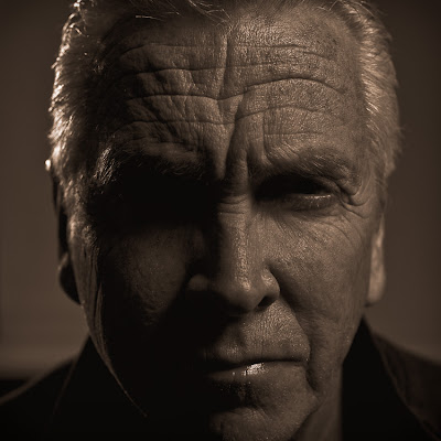
I've been into head shot's lately. What makes an interesting head shot is the expression and the light. When I have the time, I like to work on the lighting aspects of the head shot. I must say, I'm far from satisfied with these images. They're just the evolution of the process. I have figured out the traditional corporate head shot (above) but to take lighting a step further is a process of trail and error.

The top photograph is a traditional head shot that I made for a corporate client. I used four lights to achieve this shot. The other head shot is my brother-in-law Chris. His image was made using a three light set-up. I'm using a small Chimera soft box with a soft grid attached. The second and third lights are 7 inch reflectors with spot grids attached. The spot grids are 20 degree (back light) and a 10 degree (high and in front). It's a dramatic portrait but still is very basic at the core. I'm looking to raise the bar and this set-up isn't there yet.
Wednesday, February 3, 2010

Split Toning


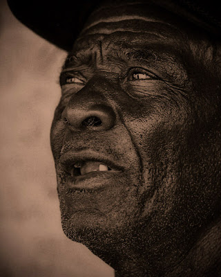
I've always been interested in gold toning and split toning of silver gelatin prints. When working in a wet darkroom the process is extensive, time consuming and hard to repeat. I wanted to see if I could come close in the digital darkroom. People with a lots of Photoshop experience would look at this and say "no sweat". For me its still a constant learning curve.

How, did I do this? I did a lot of tweaking but this is it in a nut shell. From the original color image, I went to Hue / Saturation clicked on colorize and selected sepia. I adjusted the sliders to my liking and clicked OK. Then, I imported it into Lightroom and continued to make adjustments with the split toning sliders. I then adjusted vibrancy, saturation, and clarity. I adjusted the tone curve to increase contrast and then vignetted with the lens correction tool and the post-crop tool. I exported the image out of Lightroom and re-opened it in Photoshop. I did further adjustments with levels and curves and did a little Smart sharpening and sized it for the web. That's about it. Through a little experimentation and clicking around you can create interesting and beautiful effects.

Tuesday, February 2, 2010

Allen


Converting to black and white can be so cool sometimes. In Allens case, his skin is so rich with texture and tone I thought his portrait would look great in Black and White.